Harmonic Pattern Table Inputs█ OVERVIEW
This indicator was intended as educational purpose only based on Harmonic Pattern Table (Source Code) .
Some user have different ratios in mind, thus I add input to allow user to change those ratios.
█ CREDITS
Scott M Carney, Trading Volume 3: Reaction vs. Reversal
█ CREDITS
1. List Harmonic Patterns.
2. Font size small for mobile app and font size normal for desktop.
3. Font color does automatically change follow dark / light chart theme.
4. Inputs to change ratio values.
█ USAGE / EXAMPLES
" TABLE "に関するスクリプトを検索
TradersCheckListThe Traders Check List is a unique and innovative tool designed to assist traders in their decision-making process. Unlike traditional indicators that provide signals or visual representations of market data, the Traders Check List offers a structured and customizable checklist that traders can use to ensure they're adhering to their trading plan and strategy.
While there are countless indicators available for trend detection, momentum, volatility, and other market aspects, very few tools focus on the trader's process. The Traders Check List fills this gap by providing a visual reminder of key trading considerations directly on the chart.
Functionality:
Upon applying the Traders Check List to a chart, users will see a table displayed, typically in the top right corner. This table contains rows that represent different trading considerations, such as trend direction, risk management, and psychological factors. Each row can be customized by the user to fit their specific trading plan.
For instance, a trader might have a row labeled "Trending Lower" with a corresponding "Yes/No" column to confirm if the current instrument is indeed trending downward.
Underlying Concepts:
The Traders Check List is based on the principle that successful trading is not just about market analysis but also about discipline and consistency. By having a visual checklist on the chart, traders are constantly reminded of their strategy's key components, reducing the likelihood of impulsive or emotional decisions.
How to Use:
Apply the Traders Check List to your desired chart.
Customize the rows based on your trading strategy's key considerations.
As you analyze the market, update the checklist to reflect the current conditions and your analysis.
Before entering a trade, review the checklist to ensure all criteria are met.
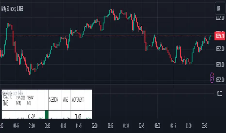
Intraday Session Table Intraday Session Table indicator up dates the values as per session input. By default session input duration is for 15 minutes. It updates the Intraday Closing Price- Open Price (CL-OP) of session at the end of the session. The next column displays the increase / decrease in CL-OP
The third column displays various values viz ROC, Closing Price, RSI(14 bars), MA20, MA50,Momentum(10 bars),Closing Price-Open Price,Net number of bars (Intraday Red bars minus Green bars) and Net intraday volume in millions.The parameters can be selected from the dropdown list in Input Box.
User can CHECK OUT Table input Box and select from the list to see individual charts.
User can analyze the movement of values to ascertain the trend.It gives fair idea of the up and down movement based on the session wise movement of values. The access to individual charts of some of the values help the user to have a graphic picture of the situation.
DISCLAIMER: For educational and entertainment purpose only .Nothing in this content should be interpreted as financial advice or a recommendation to buy or sell any sort of security/ies or investment/s.
Multi-Timeframe Trend TableThis is the first publication of an indicator to show trend on the higher timeframes and is an English version of the "Mtf Supertrend Table" coded by FxTraderProAsistan. Credit goes to him for the genesis of this work. I updated the original code to Pinescript V.5 and modified it to suit my needs. Please enjoy.
This trend table indicator has the following features:
1. Trend Mode : Option to select the method of determining trend, using the Pinescript built-in ta.supertrend function or finding trend based on the cross of 20 and 50 EMA
2. 6 trend timeframes of your choosing, with show/hide
3. Optional feature to include the DXY (US dollar) trends, for the timeframes chosen. Useful for instruments that react to changes in the US dollar
4. ATR settings to adjust the Supertrend parameters. Default values are an ATR length of 10 and a Factor of 3

Strategy Template + Performance & Returns table + ExtrasA script I've been working on since summer 2022. A template for any strategy so you just have to write or paste the code and go straight into risk management settings
Features:
>Signal only Longs/only Shorts/Both
>Leverage system
>Proper fees calculation (even with leverage on)
>Different Stop Loss systems: Simple percentage, 4 different "move to Break Even" systems and Scaling SL after each TP order (read the disclaimer at the bottom regarding this and the TV % profitable metric)
>2 Take Profit systems: Simple percentages, or Risk/reward ratios based on SL level
>Additional option on TP so last one "rides free" until closure of position or Stoploss is hit (for more than 1 orders)
>Up to 5 TP orders
>Show or hide SL/TP levels on demand
>2 date filters. Manual filter is nothing new, enter two dates/hours and filter will turn on. BUT automatic filter is another thing (thanks to user @bfr_ for his help in codingthis feature)
>AUTOMATIC DATE FILTER. Allows you to split all historical data on the chart in X periods, then choose the range of periods used. Up to 10 but that can be changed, instructions included. Useful for WalkForward simulations, haven't seen a script in TradingView that allows you to do this and test your strategy on "unseen data" automatically
EXTRA SETTINGS
Besides, some additions I like to add to my codes:
>Returns table for monthly and weekly performance. Requires recalculation on every tick. This is a modified version of @QuantNomad's work. May add lower TF options later on
>Volume Based S/R system. Original work from @shtcoinr
>One feature that was made by me, the "portfolio table". Yields info and metrics of your strategy, current position and balance. You're able to turn it off and change its size
Should anyone find an error, or have any idea on how to improve this code, please contact me. Future updates could come, stay tuned
DISCLAIMER:
In order to have accurate StopLoss hit, I had to change the previous system, which was a "close position on candle close" instead at actual stoploss level. It was fixed, but resulted on inflation of the number of trading orders, thus reducing the percent profitable and making it strongly biased and unreal. Keep that in mind, that "real" profitability could be 2x or 3x the metric TradingView says. If your strategy has a really high trading frequency, resulting in 3000+ orders, might be a problem. Try to make use of the automatic/manual date filter as workaround, I have no means of changing this, seems it is not a bug but an intended design of the PineScript Code

Volume Price and FundamentalsVolume Price and Fundamentals indicators contains 4 exponential moving averages based upon Fibonnaci numbers as period (8, 21, 55 & 144) with crossovers and crossunders.
It also contain a table for volume and 50 Day Avg. Volume, Relative volume, Change in Volume, Volume Value, Up-Down Closing Basis days in last 50 days, Volume ratio (U/D Ratio) on last 50-day Up / Down days and along with fundamental analysis table with various Fundamental Analysis parameters and QoQ & YoY comparison basis for better investment decision making.

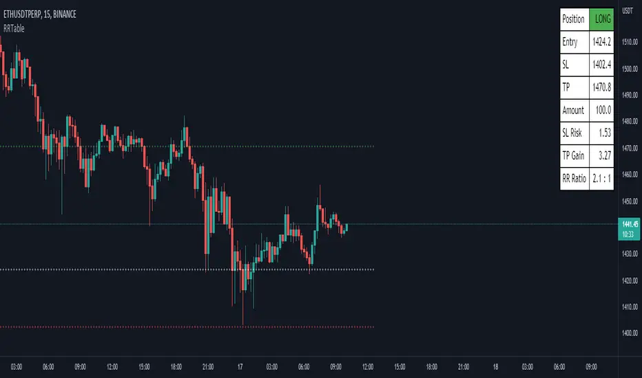
Risk Calculation Table - Amount BasedHello, this is my first script, and I believe that understanding the Risk and Reward is also the first essential step to become a successful trader.
Well maybe there are a lot of script like this but I think no one was suitable for me, so I learnt how to make one.
I think I need to explain some aspects about this script:
Input Section :
1. Entry = Entry Price.
2. SL = Stop Loss Price.
3. TP = Take Profit Price.
4. Amount = How much dollars you trade on this trade.
4. Ticker's Decimal = The number behind the decimal, to adjust this just type how much 0 you want behind the decimal.
Output Section :
1. You can adjust the lines plotted on the chart to automatically enter your entry, stop loss, and take profit price.
2. The table's appearance can be repositioned and resized.
3. The terms in the table, I think it's clear enough for everyone to understand.
If there are any critics or suggestions, I will appreciate it so much.
Greetings from Indonesia :)
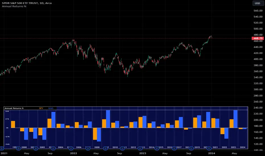
Annual Returns % Comparison [By MUQWISHI]Overview
The Annual Returns % Comparison indicator aimed to compare the historical annual percentage change of any two symbols. The indicator output shows a column-plot that was developed by two using a pine script table, so each period has pair columns showing the yearly percentage change for entered symbols.
Features
- Enter date range.
- Fill up with any two symbols.
- Choose the output data whether adjusted or not.
- Change the location of the table plot
- Color columns by a symbol.
- Size the height and width of columns.
- Color background, border, and text.
- The tooltip of the column value appears once the cursor sets above the specific column. As it seen below.
Let me know if you have any questions.
Thanks.
Multi-timeframe Moving Average with Summary TableThis script aims to keep you orientated with regard to moving averages on higher time frames when working in the lower timeframe. It will show the given MA specification from you current timeframe and the timeframes above. In addition, it also shows a summary table of what the MAs on the other timeframes are doing (trending up/down, flat).
So if you are on the 15 minute timeframe looking at the 20SMA you will know where the 20SMA is on the 1hour, 4hour, 1D, 1W, 1M. You also know the direction of the upper timeframe mas (the 1 hour is trending up but the 4hour is flat etc).
Defining whether an MA is trending is a little subjective but the script making a reasonable job of it - it compares the current MA level to the MA level the defined bars back and compares that to the average true range. (That way it works the same across all currencies regardless of their natural volatility. There is a check feature so you can understand the results your settings are creating.
summary table
show mas
check feature

Gann Square 4 Cross Cardinal Table ConceptThis indicator was intended as educational purpose only for Gann Square 4, specifically to show Cross Cardinal.
This indicator was build upon The Tunnel Thru The Air Or Looking Back From 1940, written by WD Gann.
Gann Square 4 is similar to Gann Square 9 (Refer this build) but limited to Cross Cardinal only.
Indikator ini bertujuan sebagai pendidikan sahaja untuk Gann Square 4, khusus untuk menunjukkan Cross Cardinal.
Indikator ini dibina berdasarkan buku The Tunnel Thru The Air Or Looking Back From 1940, ditulis oleh WD Gann.
Gann Square 4 hampir sama dengan Gann Square 9 (Rujuk binaan ini) tetapi terhad kepada Cross Cardinal sahaja.
Indicator features :
1. Font size from tiny to huge.
2. For desktop display only, not for mobile.
3. All values can be selected individually.
Kemampuan indikator :
1. Saiz font dari paling kecil ke paling besar.
2. Untuk paparan desktop sahaja, bukan untuk mobile.
3. Semua nilai boleh dipilih secara individu.
FAQ
1. Credits / Kredit
WD Gann , The Tunnel Thru The Air Or Looking Back From 1940
Ganzilla
2. Page involved / Muka Surat terlibat
195 - 198
3. Code Usage / Penggunaan Kod
Free to use for personal usage.
Bebas untuk kegunaan peribadi.
Left : All values off / Kiri : Semua nilai off
Right : All values on / Kanan : Semua nilai on
Left : Random Usage / Kiri : Kegunaan Random
Right : Ideal Usage / Kanan : Kegunaan Ideal
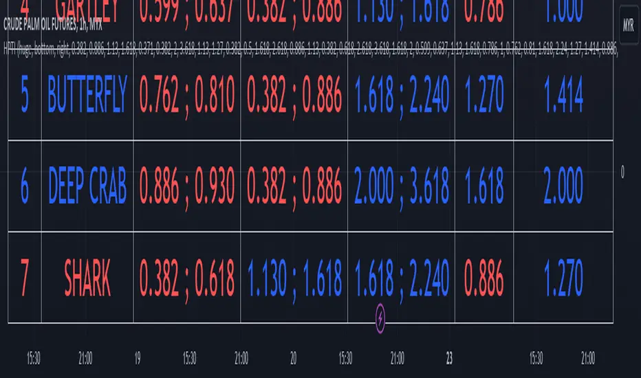
Harmonic Trading Ratios Educational (Source Code)This table indicator was intended as educational purpose only for Harmonic Trading Ratios.
The ratios are used for Harmonic AB=CD and XAB=CD.
Ratio calculation are shown for Retracement and Projection based Primary, Primary Derived, Secondary Derived and Secondary Derived Extreme.
Primary Retracement : 0.618
Primary Projection : 1.618
Please take note that Secondary Derived Extreme is only available for Projection.
Indikator berjadual bertujuan sebagai pendidikan sahaja untuk Harmonic Trading Ratios.
Ratio digunakan untuk Harmonic AB=CD and XAB=CD.
Pengiraan ratio untuk Retracement and Projection adalah berdasarkan Primary, Primary Derived, Secondary Derived dan Secondary Derived Extreme.
Primary Retracement : 0.618
Primary Projection : 1.618
Sila ambil perhatian bahawa Secondary Derived Extreme adalah untuk Projection sahaja.
The values shown in table was based on Harmonic Trading: Volume One, Page 18 written by Scott M Carney.
Nilai yang ditunjukkan dalam jadual adalah berdasarkan buku Harmonic Trading: Volume One, Page 18 ditulis oleh Scott M Carney.
Indicator features :
1. List Harmonic Trading Ratios including calculation.
2. Show and draw individual Harmonic Trading Ratio.
3. For desktop display only, not for mobile.
Kemampuan indikator :
1. Senarai Harmonic Trading Ratios termasuk pengiraan.
2. Memapar dan melukis Harmonic Trading Ratio secara berasingan.
3. Untuk paparan desktop sahaja, bukan untuk mobile.
FAQ
1. Credits / Kredit
Scott M Carney,
Scott M Carney, Harmonic Trading: Volume One
2. Code Usage / Penggunaan Kod
Free to use for personal usage but credits are most welcomed especially for credits to Scott M Carney.
Bebas untuk kegunaan peribadi tetapi kredit adalah amat dialu-alukan terutamanya kredit kepada Scott M Carney.
Display for Bullish / Bearish Retracement
Paparan untuk Bullish / Bearish Retracement
Display for Primary Retracement and Primary Projection
Paparan untuk Primary Retracement and Primary Projection
Display for Secondary Derived Extreme Retracement and Secondary Derived Extreme Projection
Paparan untuk Secondary Derived Extreme Retracement and Secondary Derived Extreme Projection

Technical Ratings Colored CandlesFor those that want technical ratings but don't want waste valuable screen real estate. Candles are colored to the rating strength. It also plots the results for "total", "MA" and "other" in a table on right of screen. Table and candle coloring can be turned off in style settings. This script uses the built in Technical Ratings indicator. For more informations on Technical Ratings please refer to official documentation.
ADR% / ATR / LoD dist. TableDisplays the following values in a table in the upper right corner of the chart:
ADR%: Average daily range (in percent).
ATR: Average true range (hidden by default).
LoD dist.: Distance of current price to low of the day as a percentage of ATR.
All values are calculated based on daily bars, no matter what time frame you are currently viewing. Doesn't work for time frames >1D, which is why the table is not shown on weekly/monthly charts.
Credit to MikeC / TheScrutiniser and GlinckEastwoot for ADR% formula


SIDD Table Volume multiframe (Modified)🚀 SIDD Volume Table – The Most Powerful Multi-Timeframe Volume Dashboard
Designed by Siddhartha Mukherjee (SIDD)
Free for the community.
Get an unfair edge with the cleanest, fastest, and most accurate multi-timeframe volume analyzer available on TradingView. This tool reveals where buyers and sellers are truly active across multiple timeframes—helping you confirm trends, avoid traps, and enter with confidence.
🔥 Why Traders Love This Indicator
✅ 1. Multi-Timeframe Volume Domination
Instantly view Buy% / Sell% / Total Volume for:
1m • 5m • 15m • 1H • 4H • 1D • 1W
Choose any combination you want!
✅ 2. Advanced Buy/Sell Volume Logic
Not simple volume…
This tool breaks it into:
Buy Volume% (green dominance)
Sell Volume% (red dominance)
Using candle structure (H-L-C), giving far more accurate pressure detection.
✅ 3. Realtime Candle Countdown
Never guess when a candle will close again.
Get:
Seconds (1m)
MM:SS (5m/15m/1H)
DD:HH:MM:SS (4H, 1D, 1W)
Perfect for scalpers, swing traders, and index traders.
✅ 4. Beautiful & Customizable Dashboard
Choose position anywhere on screen
Auto size or choose Tiny → Huge
Color-coded Bias (Green Buyers, Red Sellers)
Clean layout built for modern charts
Your chart stays clean while your data stays powerful.
💡 What This Helps You Identify
Where buyers are gaining strength
Where sellers are dominating
Multi-timeframe alignment (the key to big moves)
Real reversal pressure
Volume divergence across timeframes
Trend confirmation before breakouts
Perfect for:
NIFTY / BANKNIFTY / Stocks / Crypto / FX / Commodities
🧠 Who Should Use This?
Intraday traders
Swing traders
Options traders
Futures traders
Crypto scalpers
Professional volume analysts
If volume matters to you → this indicator becomes a must-have.
🛠 Built with Precision
Non-repainting
Multi-TF aligned
Fast + lightweight arrays
Uses BTC/ETH feed to stabilize ticks
Zero chart clutter
❤️ Free for Everyone
This tool is released 100% free to help the community trade with clarity and confidence.
Leave a like ⭐, comment 💬, or follow if you want more such institutional-grade tools.
⚠️ Disclaimer
This is for educational/analytical use only.
Not financial advice. Trade at your own risk.

TFU Multi-Symbol Screener + VWAP + Table Size Option + Blank RowTFU Multi-Symbol Screener + VWAP + Table Size Option + Blank Row

Custom ATR TableThis indicator is intended to displays a simple, data-rich ATR table that summarizes volatility and directional bias based on the Average True Range (ATR). It helps you quickly see:
The current daily range relative to ATR
Potential call and put trigger levels
The trend bias based on EMAs
ATR measures the average daily volatility — how much price typically moves in one day. This helps identify if the market is moving more or less than usual and calculates how much of the ATR that range covers.

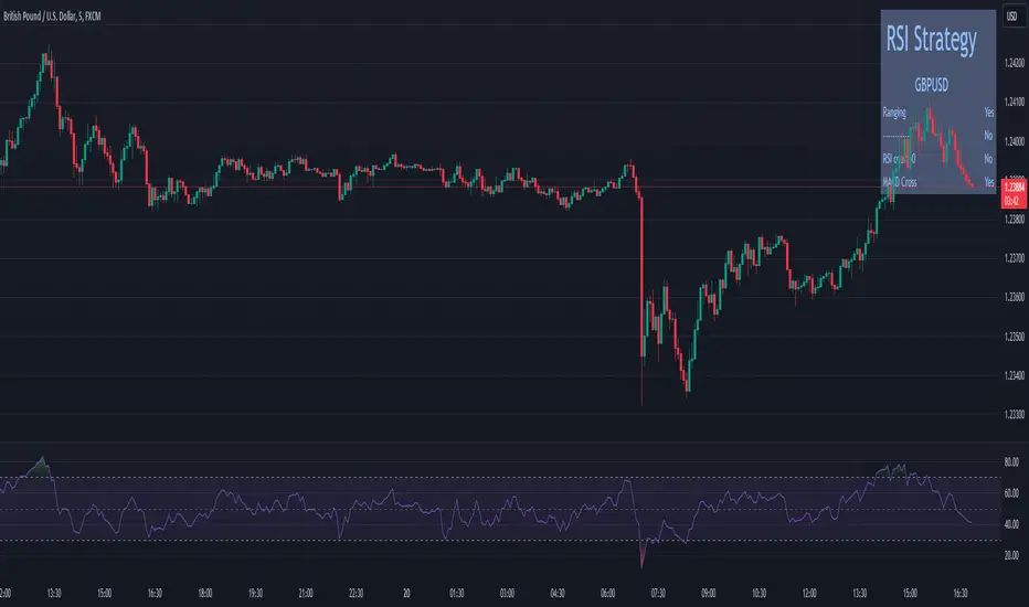
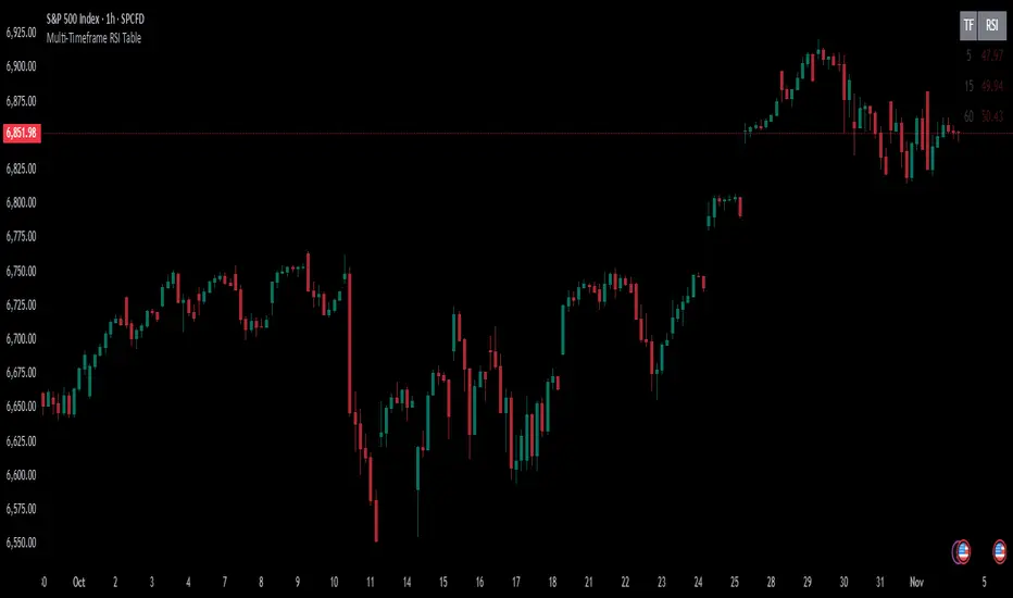
Multi-Timeframe RSI TableIt can print RSI values of any four chosen periods in a tabular format on the chart itself. The table can be placed in any of the six positions, as required. If the RSI values are more than 40 or less than 40, these values are shown in bright Red, else it is light Red.
Avg Candle Size Table (Ticks) The average of the last N candles in ticks shown on a table in the top right of the chart


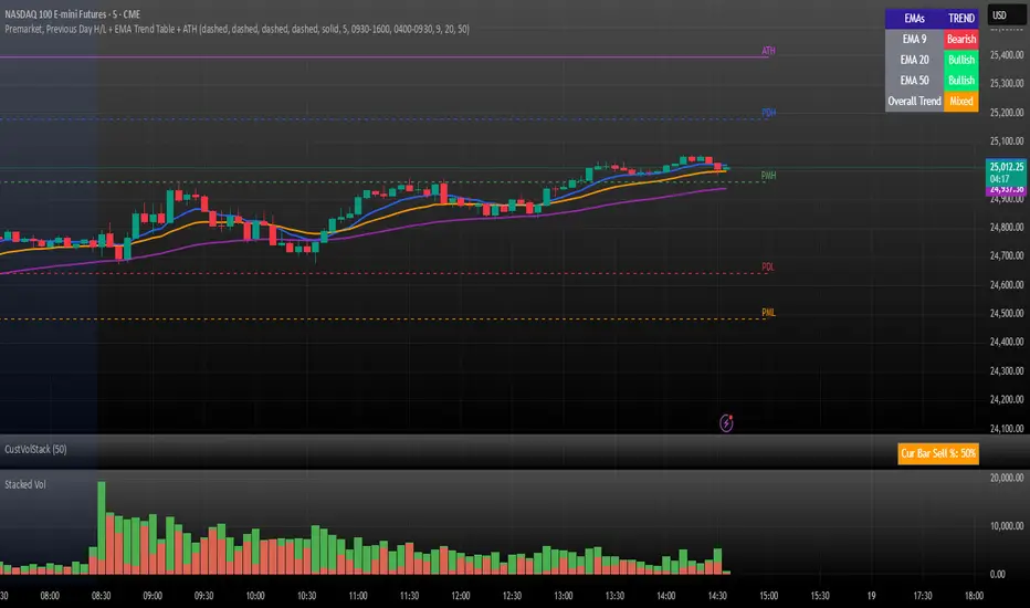
Premarket, Previous Day H/L + EMA Trend Table + ATHPremarket, Previous Day H/L + EMA Trend Table + ATH
Customizable Dashboard (SIMPLE)This is a custom table where you can track any ticker and it's daily change. color coded to make things easy.

Bias Table-manualIt is just at tabular column to manually update Bullish/Bearish for multiple timeframes. Provided date option which is also manual, to denote when the analysis was done and table updated. This will be helpful for multiple stocks/securities analysis on regular basis
